Data Visualization as a Tool for Effective Story Telling
Most of you have seen large dashboards covered with dozens of gauges, widgets and assorted charts; but, after looking at these expansive dashboards, what did you learn from them and what decisions were you able to make or did you simply think that’s nice and moved on.
One problem with the increasing amounts of data and its associated visualization is a lack of focus or purpose. The goal of data visualization is to communicate information in a clear concise fashion so that insights can be gained, and actionable decisions can be made. The proper sequencing and arrangement of individual charts and graphs can be used to communicate compelling stories however; that rarely happens.
So, how can data visualization be used to communicate a story? Well, let's consider the structure of a story. A story has a plot, represented as a series of events. Chapters further define the story, providing additional information all building up to the conclusion.
The same structure can be applied to data visualization, where the plot of the story represents the overall goal of the visualization effort. Chapters will be specific questions or issues being addressed, with the order of presentation representing the series of events that lets the story unfold. This approach to data visualization. requires more organization that simply placing tiles on a canvas, but the results are more useful and satisfying.
Documentation and planning are a key component of the storytelling process. So, before beginning a visualization effort, consider and document the following:
- Who is the audience?
- What is the overall purpose and goal of the visualization solution?
- What are the specific business questions or issues being addressed?
- Pay attention to the overall flow of how one visualization and concept links to the next. This will define the narrative.
- Keep things simple and don't include irrelevant information, minimizing clutter.
- Consider the experience of how users will interact with the visualizations.
- Over time, re-visit the visualization solution to make sure needs have not changed and the story is still relevant
Up to this point, there has been no mention of a specific visualization tool. That's because the tool is not as important as the information being conveyed. The tool can be as simple as pencil and paper, whiteboard, or another available software-based tool. The purpose of the tool at the initial stages is to mock up stories and validate information content and flow.
It should be possible to develop and write a narrative based on the information content and storyline (flow). Here is a simple example of visualization story development:
Example
This story is for an organization that wants to determine where their new product development resources should be focused.
Goal definition or outcome - Recommend where new production should be focused.
Business question(s) to be answered and storyline(flow)
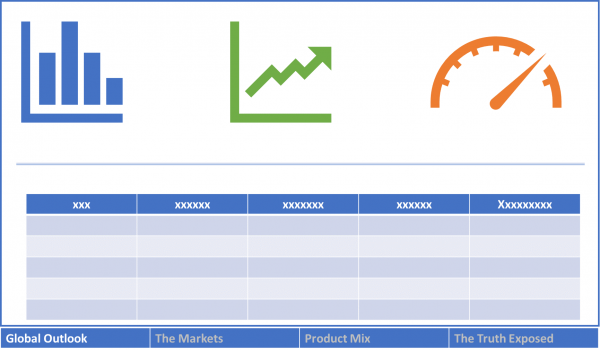
Chapter 1 - Global Outlook (global summary)
Chapter 2 - The Markets (market breakdown)
Chapter 3 – Product Mix (regional product allocation)
Chapter 4 - The Exposed (allocation of production resources)
Narrative - There has been an increase in global production. We need to understand production in terms of quantities and revenue by region across all product lines. This will show where to focus efforts on allocating production resources across regions.
From the goal definition, business questions (chapter titles) and narrative, it's clear at a high-level what content should be displayed, the order and flow of the information and the level of detail required.
A more sophisticated tool may now be used to render end deploy the visualization solution. At this stage, using a tool allows experimentation with and development of the user experience. This is also where the look and feel can be addressed.
In the following image, a block representation is used to depict the story. All the elements of our storyline are included as sections (chapters) of the story. Annotations can be provided for clarity to indicate story branches and where additional details should be displayed. Also, note that there is no clutter. There is a tendency to cram as much information as possible in a chapter; this leads to confusion and frankly is not very nice to look at. Keeping the story simple and clean is a much more enjoyable experience for the reader.
The diagram above can be easily replicated for the other chapters. Some may ask why not just grab a tool and start dropping widgets on a page. One reason for not taking that approach is that more time is spent on formatting details than on the overall big picture. Formatting details such as line colors and fonts should be addressed later after the story has been laid out and communicated.
Granted this is a simple example, but the more complex the information to be communicated is, the more up-front planning is needed. Creation of the final visualization story is more of an art and will require multiple iterations, however; a good plan will speed up the process and generate better results.
Storytelling with data visualization is more than just placing charts on a canvas, requiring an understanding of the audience and providing information that meets their expectations in a clear, concise and organized fashion. Following the outlined approach should get you on your way to becoming an effective storyteller using data visualization.